PROJECT
Early Life Support Psychology - Brand Identity Design
Early Life Support psychology will be offering meaningful support for mothers, parents, babies and young children for the first 1000 days and beyond.
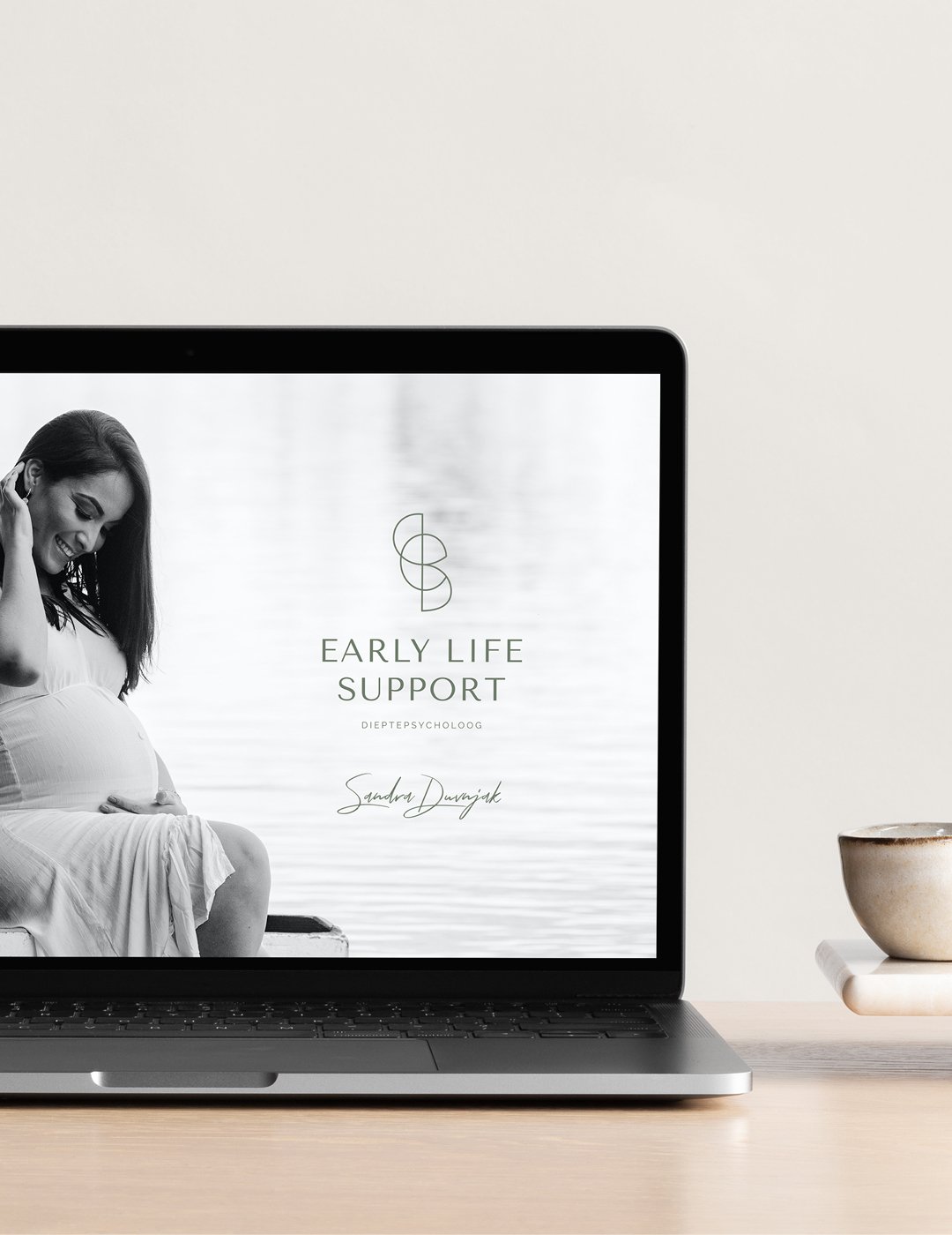
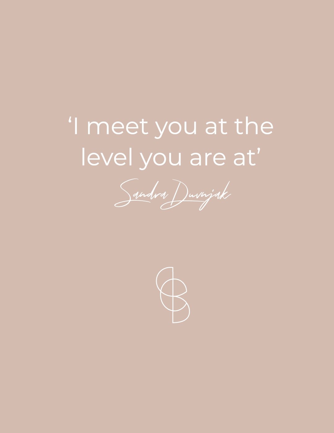
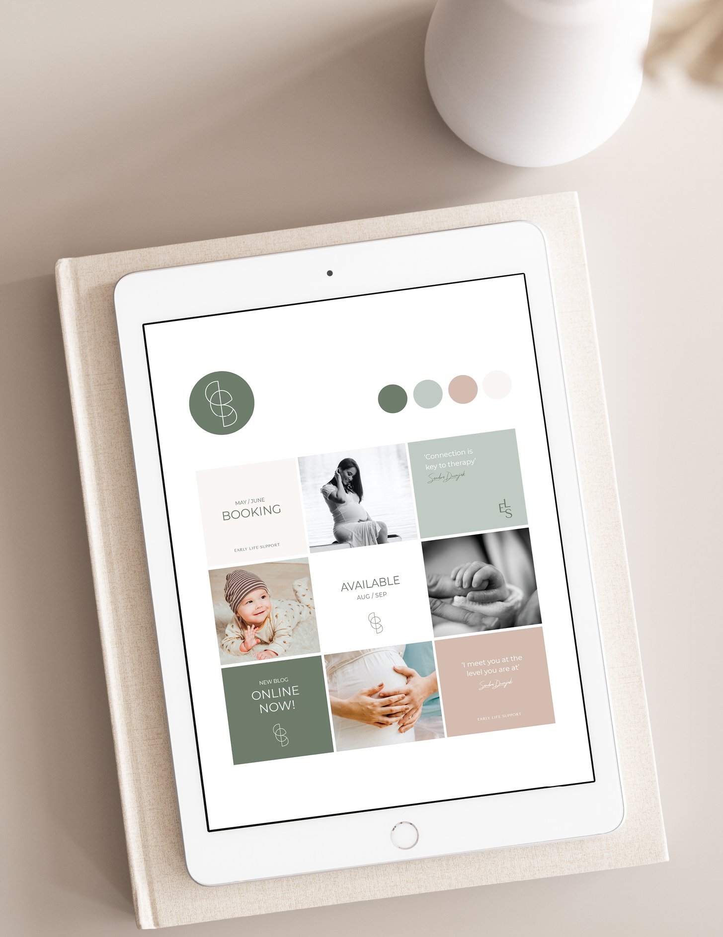
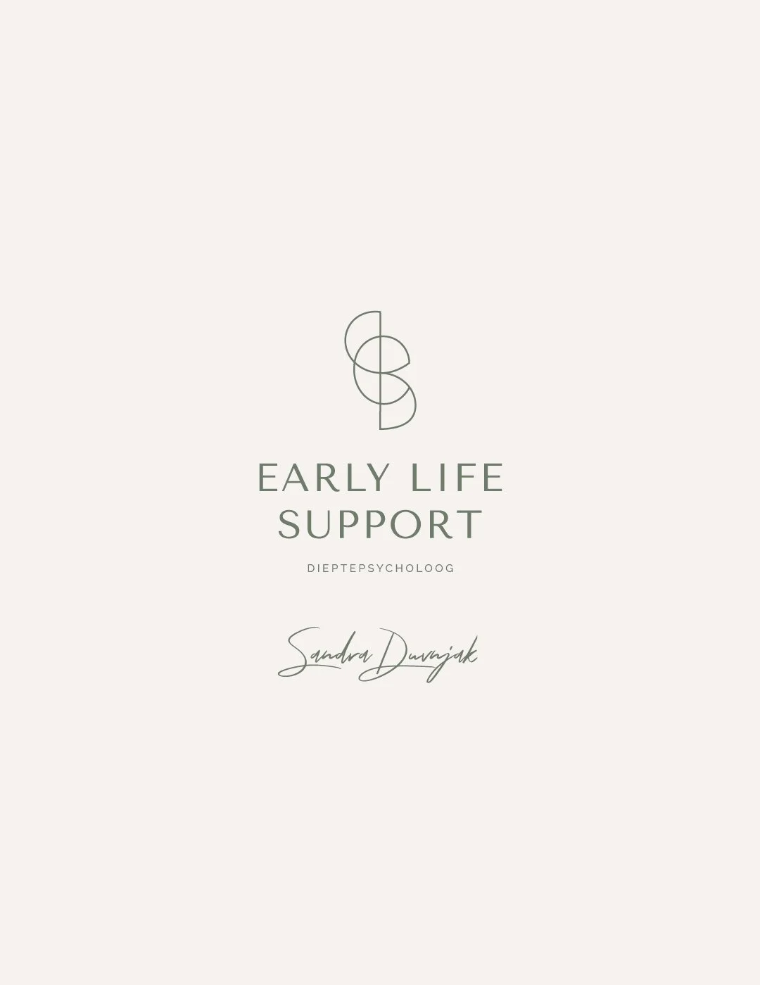
The aim was to reflect the business’s non-clinical and authentic approach to psychology in the visual brand design. The stylised brand icon logo is formed with the brand letters ‘e’, ‘i’ and ‘s’, which are intertwined to represent the connection between the psychologist and her clients. Created with curved, approachable shapes to symbolise how the psychologist views her clients’ problems holistically by going to the core to support, help and empower them. The icon is paired with a trustworthy and reliable font style to reflect the expert nature of the service. A green colour palette was chosen for the main brand colour to represent wisdom and professionalism, balanced with neutral, warm tones.
The outcome of this visual brand identity is professional, authentic, helpful, inspiring and strong, just like the client I had the pleasure of working with.

“Working with Effie Ana Design was an unforgettable experience. From the very beginning, she understood the essence of what I was trying to express, even when I didn’t have the words for it myself.
When I saw the first concept, I cried. For the first time, I felt seen. She translated my vision, something I had only ever felt intuitively , into a stunning, coherent brand identity. Every detail felt aligned, intentional, and deeply personal.
She didn’t just create a brand for me, she brought it to life. I couldn’t have imagined a more empowering and inspiring process. Thank you from the bottom of my heart! Your work is pure magic. Lot’s of love Sandra.”
Sandra